The Job
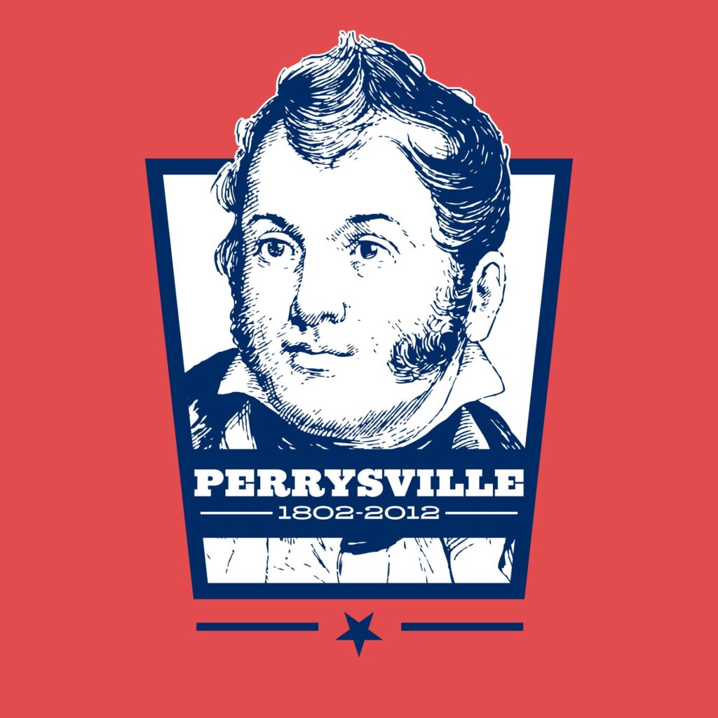
Perrysville, OH was celebrating its 200th anniversary and announced a contest to design a logo for the event “to spark community awareness and excitement”.
The Solution
Like many of my projects, this one began with a history lesson. Perrysville had been named after Commodore Oliver Hazard Perry, a hero of the War of 1812 during the Battle of Lake Erie. After losing four of his five ships, Perry was famously rowed to his final ship with a flag reading “Don’t Give Up the Ship”. With my design, I wanted to incorporate as much of this history as possible. Combining a holding shape based off the Navy sleeve stripe for commodore rank, an etching of Perry, and the strong, bold Ziggurat typeface, I felt I achieved this. …But the voting panel did not and another design was chosen.

The Job
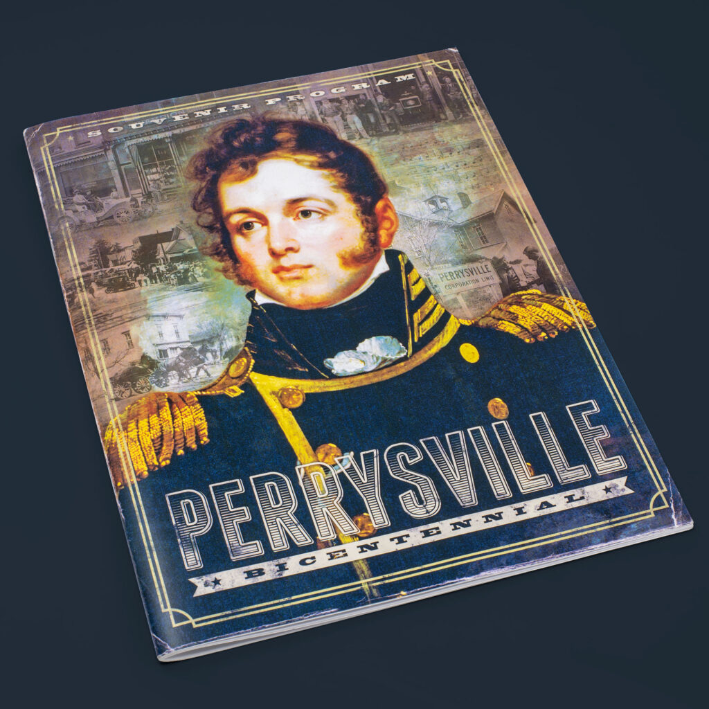
Despite not winning the logo competition, I was offered the chance to design a promotional pamphlet that would be offered at the bicentennial celebration. Within it would be historical articles, photos, biographies, and more.
The Solution
I set out to give the book a worn effect to match the winning logo by using separate “aging” layers, old-style typefaces, and beveled borders. Every ad was designed by me to fit this direction, within reason. I was also responsible for page layouts and order to ensure the entire book fit within 40 pages.

