The Job
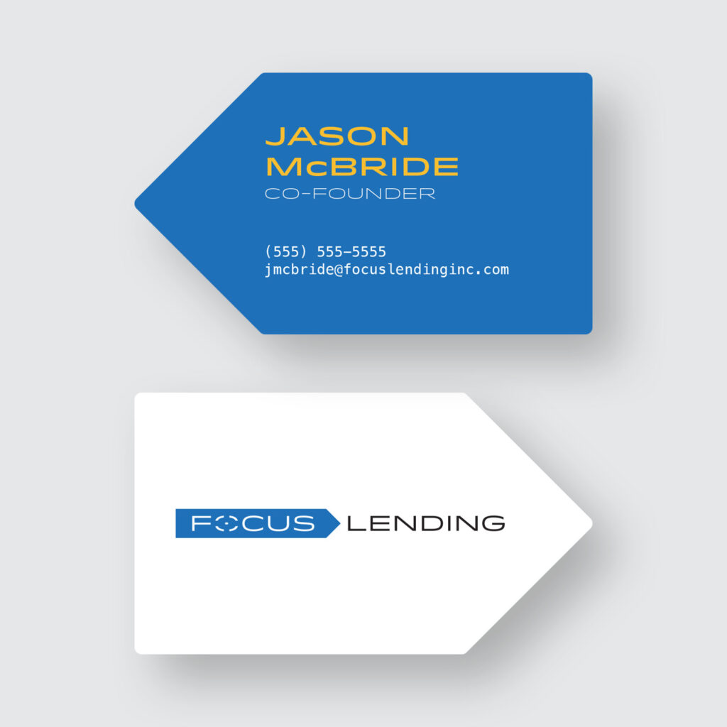
A client was starting a new, independent multi-strategy lending consultant and needing help developing a look that would draw in new business. He wanted something professional and eye-catching to immediately communicate a sense of trust.
The Solution
Combining ideas of bank lending papers and the word “focus”, I arrived at the idea of a chevron shape, based off of a “sign here” sticky note. An accented “O”, resembling a camera focus point, was added as a secondary logo element. When deciding on a font, we chose Idlewild for its clean, modern, and professional letterforms. Carrying these ideas into business cards, I chose to maintain the chevron shape as a way to distinguish Focus Lending from its many competitors in a prospect’s wallet.

